El momento
El siguiente paso.
Cuando alguien quiere llevar su negocio más lejos y busca con quién hacerlo posible.


This is the foundation of the Grou brand. Everything you need to build with us lives here: our brand framework, logos, fonts, and color palette, so the brand stays consistent everywhere it shows up, with room to grow as we do.
Grou nace de una convicción construida en la práctica: el valor que alguien crea merece encontrar las condiciones para convertirse en un negocio que crece.
La experiencia en Beemo nos enseñó a mirar el negocio completo. La venta, el acceso al pago, la financiación, la recurrencia, el método y las personas forman parte de una misma realidad. Crecer exige conectarlas.
Por eso elegimos el crecimiento como centro de la marca. Está en el nombre, orienta lo que construimos y define el resultado al que queremos contribuir.
El efecto que buscamos es concreto: que quienes crean conviertan más oportunidades en ingresos y vivan el crecimiento de sus negocios.
El momento
Cuando alguien quiere llevar su negocio más lejos y busca con quién hacerlo posible.
Para quién
Creadores, academias y negocios digitales que quieren avanzar hacia una nueva etapa.
Nuestro papel
Conectar herramientas, procesos, tecnología y acompañamiento para dar ese paso.
Esta idea define el lugar que Grou quiere ocupar en la mente del cliente: el siguiente paso. El momento en el que alguien siente que su negocio puede dar más y busca con quién hacerlo posible.
Las herramientas, los procesos, la tecnología y el acompañamiento adquieren sentido al ayudar al cliente a entrar en esa nueva etapa. La próxima etapa de crecimiento es la idea; la infraestructura es lo que la hace posible.
Hacer posible el crecimiento.
“Make growth possible” expresa el papel de Grou: crear las condiciones para que el cliente pueda crecer. La misión da una dirección común a la tecnología, las metodologías, la financiación y las personas que ponemos al servicio de su negocio.
El crecimiento es el propósito que une lo que hacemos. La formulación abarca a creadores, academias y otros negocios digitales, y se conecta con nuestra idea de marca: ser la plataforma para su próxima etapa. Nuestra misión es hacerla posible.
Catorce convicciones para decidir, construir, vender y liderar. El punto de encuentro con quienes quieren crecer como nosotros.
Creencia
El crecimiento mantiene relevante al negocio. Esta convicción nos exige revisar continuamente dónde podemos crear más valor.
Creencia
La rentabilidad da sentido al esfuerzo comercial. El volumen debe traducirse en un negocio económicamente más sano.
Creencia
Antes de buscar más oportunidades, vale la pena aprovechar mejor las que ya existen. Allí puede estar una parte del resultado que falta.
Creencia
La financiación y las alternativas de pago amplían las posibilidades de acceso. Hacer posible una compra también forma parte de crear valor.
Creencia
La experiencia produce método. La tecnología vuelve ese método repetible y lo pone al alcance de más negocios.
Creencia
La confianza tiene un componente humano. La tecnología debe ayudar a que esa relación sea más cercana y significativa.
Creencia
Cada iniciativa debe justificar su aporte. Evaluar su efecto ayuda a proteger el foco y a liberar recursos para lo que sí mejora el negocio.
Creencia
La venta merece atención sostenida: preparación, seguimiento y aprendizaje. La obsesión se convierte en una disciplina de ejecución.
Creencia
Entender el mercado y comunicar valor amplía las posibilidades de un negocio. El marketing reúne sensibilidad, criterio y capacidad de ejecución.
Creencia
La creatividad abre posibilidades: nuevas ofertas, mejores mensajes y formas distintas de resolver problemas. Es una capacidad que impulsa todo el negocio.
Creencia
Decidir crecer implica asignar recursos, elegir prioridades y asumir compromisos. La ambición empieza a producir cambios cuando se convierte en acción.
Creencia
Los procesos, la tecnología y el conocimiento acumulado permiten repetir lo que funciona sin empezar de cero cada vez. Así construimos capacidad para sostener el crecimiento.
Creencia
Construir empresa exige procesos, responsabilidades y una operación que pueda avanzar más allá del esfuerzo personal del fundador. Esa estructura hace posible la siguiente etapa.
Creencia
Una venta se celebra por lo que representa hoy y transforma por lo que permite construir mañana: reinvertir, desarrollar capacidades y sostener el negocio.
Las creencias convierten la estrategia en criterios de comportamiento. Reúnen nuestra mirada sobre crecimiento, rentabilidad, ventas, financiación, creatividad y construcción de empresa.
Su valor aparece cuando orientan una decisión: qué priorizar, qué desarrollar, cómo tratar a un cliente y qué exigirnos como equipo. También convocan a una comunidad que reconoce esas convicciones como propias.
Desde nuestro nombre hasta nuestros procesos, herramientas y equipos, Grou fue pensada y diseñada para la próxima etapa de quienes ya venden. Nuestra obsesión es ayudarte a aprovechar mejor las oportunidades que tu negocio ya genera y convertirlas en más ventas.
Por eso conectamos tecnología, pagos, financiación y capacidad comercial alrededor de un mismo propósito: que tengas con qué dar el siguiente paso.
En Grou no tenemos KAMs. Tenemos Growth Managers.
Identificar dónde está la siguiente oportunidad de crecimiento.
Conectar las capacidades que necesita cada negocio.
Actuar sobre ventas y pagos que no se concretaron.
Medir lo que funciona para volver a hacerlo.
Un creador termina su lanzamiento. Hay personas interesadas que no compraron y otras cuyo pago falló. El Growth Manager identifica con él dónde están esas oportunidades y qué acciones activar: recuperación comercial, recuperación de pagos u opciones de financiación, según el caso.
El trabajo continúa sobre la demanda que el negocio ya generó. Nuestro sistema está diseñado para ayudar a convertir esas oportunidades en ingresos y evitar que se quede dinero en la mesa.
“Ya vendes” reconoce el camino recorrido y define a quién priorizamos. “Ahora vende más” expresa el siguiente avance que Grou debe ayudar a hacer posible. La propuesta parte de un negocio real, con ventas y oportunidades sobre las que podemos actuar.
Incluso el nombre del equipo expresa esa intención: GMs (Growth Managers) en lugar de KAMs (Key Account Managers). Su papel es identificar oportunidades y movilizar capacidades para el crecimiento. Producto, procesos y acompañamiento deben demostrar esa orientación en la experiencia y los resultados del cliente.
Reconocer dónde están mis oportunidades y qué está limitando mis resultados.
Elegir qué activar según el momento y las prioridades de mi negocio.
Contar con herramientas y acompañamiento para ejecutar y aprender de los resultados.
La propuesta está expresada en primera persona porque describe lo que el cliente gana al elegir Grou: capacidad para dirigir su crecimiento. Tener visibilidad sobre el negocio, tomar decisiones y contar con medios para llevarlas a la práctica hace que esa sensación de control tenga un fundamento concreto.
Crecer también trae complejidad. El valor de Grou está en ayudar al cliente a conducir esa evolución, aprovechar oportunidades y construir una operación que pueda sostenerla. El crecimiento debe estar al servicio de su empresa y su ambición.
Control significa poder intervenir, medir y ajustar. La emoción que buscamos es la confianza de saber qué hacer después y tener con qué hacerlo.
En Grou nos comprometemos a poner todos nuestros esfuerzos al servicio de un propósito: ayudarte a ganar más y hacer crecer tu negocio.
Cada decisión que tomamos y cada solución que desarrollamos debe acercarte a ese objetivo. Escucharemos tus necesidades y evolucionaremos contigo para que encuentres en Grou las capacidades que necesitas para seguir avanzando.
Mediremos nuestro aporte por los resultados que te ayudamos a conseguir.
Priorizar el aporte al crecimiento del cliente.
Entender lo que su negocio necesita para avanzar.
Desarrollar capacidades para su siguiente etapa.
Aprender de los resultados a los que contribuimos.
La promesa convierte la intención de la marca en una obligación de trabajo: orientar esfuerzos y decisiones al crecimiento del cliente. Es el criterio con el que podemos evaluar nuestro aporte.
Escuchar, evolucionar y medir hacen ese compromiso observable. Su cumplimiento depende de una conducta consistente a lo largo de la relación.
Catorce expresiones aprobadas para llevar la idea de crecimiento al website, las campañas, la comunidad y las piezas de marca.
Website · mensaje principal
Ubica a Grou en un momento de decisión: avanzar hacia la siguiente etapa.
Adquisición · propuesta comercial
Lleva la conversación a un beneficio que el creador entiende: ganar más.
Campaña de marca
Une creación y crecimiento en una frase que reconoce el valor de lo que el cliente construye.
Posicionamiento · ventas B2B
Conecta una aspiración emocional con la categoría estratégica de Grou: infraestructura.
Activación · oportunidades
Invita a descubrir ingresos posibles dentro del negocio que ya existe.
Campaña · rentabilidad
Vuelve tangible el crecimiento y lo acerca a lo que gana el cliente.
Contenido · historias de clientes
Expresa la emoción de vender y el efecto más profundo de hacer crecer un negocio.
Branding · historia del nombre
Hace explícita la asociación entre Grou y el territorio de crecimiento.
Gorras · indumentaria · marca
Condensa la idea de estar diseñados para crecer en una expresión breve y propia.
Comunidad · activación · cierre
Convierte el nombre en una invitación compartida a avanzar.
Campaña · activación
Invita a dar el siguiente paso desde una realidad comercial existente.
Branding · cultura
Expresa la vocación de crecimiento que guía a Grou.
USP · adquisición
Reconoce a quien ya vende y lo invita a avanzar.
Propuesta de valor · marca
Expresa la capacidad de dirigir el crecimiento del negocio.
Los taglines expresan distintos aspectos de una misma estrategia: la próxima etapa, los ingresos, el valor de crear, la infraestructura y el crecimiento que está en nuestro nombre.
Elegimos cada expresión según la intención de la pieza. La consistencia nace de compartir un significado y una personalidad reconocibles a través de todos los formatos.
Grou es la plataforma para la próxima etapa de quienes ya venden.
Creadores, academias y negocios digitales que han demostrado demanda y quieren avanzar.
Buscan aprovechar mejor sus oportunidades y construir capacidad para sostener el crecimiento.
Growth Managers, tecnología de pagos y capacidad comercial conectados con el siguiente paso del negocio.
El espacio que queremos ocupar es el paso de un negocio que ya vende a un negocio preparado para vender más. La experiencia comercial del cliente es el punto de partida: ya ha construido algo que funciona y necesita ampliar lo que puede lograr con ello.
Este foco orienta a quién buscamos, cómo hablamos y qué desarrollamos. Priorizamos las oportunidades de ingreso que se pierden, las barreras de pago y los procesos que deben evolucionar para sostener una operación mayor.
Queremos que, cuando alguien piense “ya vendo, ahora quiero vender más”, piense en Grou. Ese lugar se gana con resultados y una experiencia consistente: cada solución y cada conversación deben acercar al cliente a su siguiente etapa.
Grou. Ahora vendes más.
Our logo system includes the horizontal wordmark and the avatar. Use them consistently so the brand stays recognizable across any medium, digital or print.
Because Grou's presence lives largely online, a consistent avatar is critical to ensure people recognize the brand across spaces. In many cases this symbol is the first introduction to Grou.
Formats: PNG and SVG
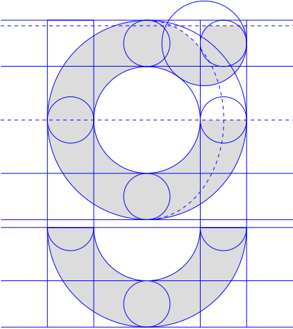
The brandmark is built on a precise geometric grid. The proportions and relationships between elements guarantee visual balance and consistency at any scale.
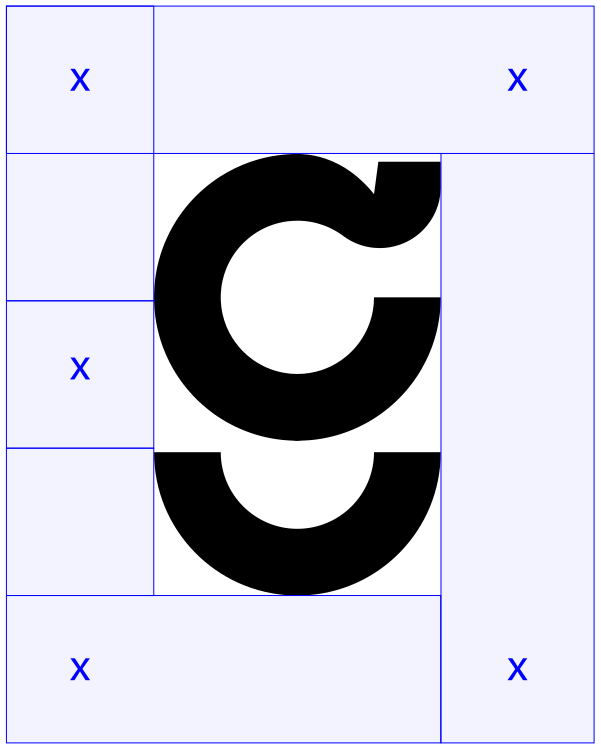
Always maintain a protection area around the brandmark, free of other graphic elements or text. This minimum space safeguards its legibility and visual impact.

Our typographic signature uses custom letterforms inspired by the curves and shapes of the Grou symbol. The logo can be used in one of two colors: black or white.
Formats: PNG and SVG
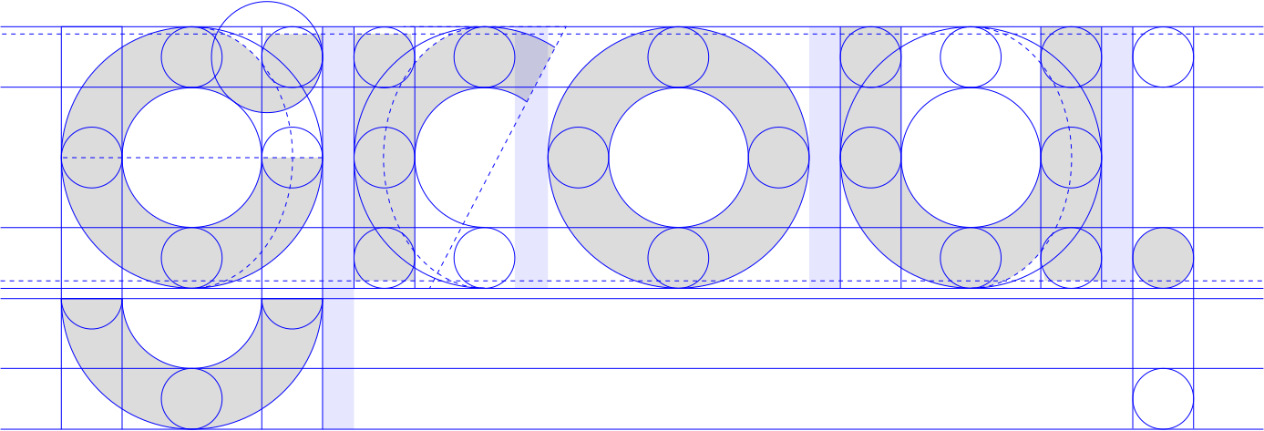
The wordmark is built on a modular grid that defines heights, widths and spacing. This architecture ensures the logo's typographic integrity across any application.
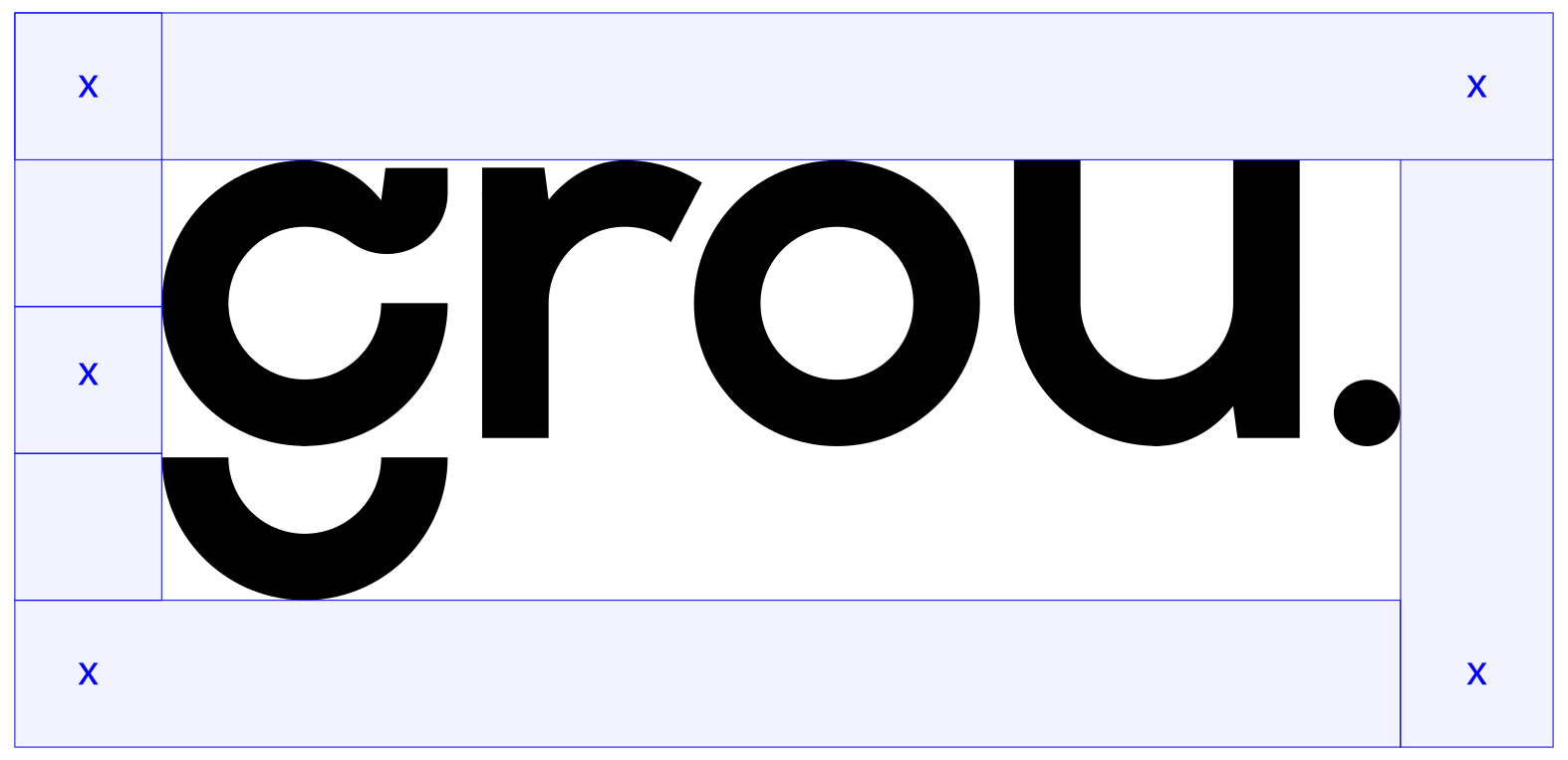
Respect the clearance area around the wordmark. Keeping this margin clear ensures the brand holds its presence and never competes visually with other elements.






Grou avatars come in two formats: circle and square. Each offers five color combinations to adapt to different backgrounds and contexts while keeping the brand's presence and recognition intact.
Grou's color system is anchored by two primaries, Absolute White and Soft Black, and supported by a neutral secondary pair for subtle contrast, soft surfaces and secondary text.
Absolute White and Soft Black carry structure, surfaces and text. Use them as the foundation for every composition.
Absolute White
Light backgrounds · light text on dark
Soft Black
Dark backgrounds · default text color
Light Gray and Dark Gray extend the primary neutrals. Use them for soft backgrounds, hover states, secondary text and contrast blocks.
Light Gray
Soft backgrounds · subtle fills · hover states
Dark Gray
Dark accents · secondary text · contrast blocks
Grou's wordmark is custom-drawn. For headlines and large titles we use Grou Season Neue Mix, our signature display face. For UI, body copy and long-form reading we use Pathway Extreme. Grou Season Neue Mix is reserved for headlines only, never for UI components or body text.
GROU SEASON NEUE 500 • REGULAR
HEADLINES
Aa Bb Cc
ABCDEFGHIJKLMNOPQRSTUVWXYZ
abcdefghijklmnopqrstuvwxyz
0123456789 .,!?@#&*
Limited Font License · Available via request
Helvetica Neue 400 · Regular
TITLES • SUBTITLES • BODY TEXT • UI COMPONENTS
Aa Bb Cc
ABCDEFGHIJKLMNOPQRSTUVWXYZ
abcdefghijklmnopqrstuvwxyz
0123456789 .,!?@#&*
Helvetica Neue 500 · Medium
Aa Bb Cc
ABCDEFGHIJKLMNOPQRSTUVWXYZ
abcdefghijklmnopqrstuvwxyz
0123456789 .,!?@#&*
Licensed Font · Available via request
How they work together
Typography that scales with clarity from a banner to a contract.
Grou Season Neue Mix carries the voice on headlines and large titles only. Pathway Extreme handles everything else: UI components, body copy, descriptions and documentation. Together they give the brand a distinctive, human and highly readable tone.